- Power Apps Community
- Welcome to the Community!
- News & Announcements
- Get Help with Power Apps
- Building Power Apps
- Microsoft Dataverse
- AI Builder
- Power Apps Governance and Administering
- Power Apps Pro Dev & ISV
- Connector Development
- Power Query
- GCC, GCCH, DoD - Federal App Makers (FAM)
- Power Platform Integration - Better Together!
- Power Platform Integrations (Read Only)
- Power Platform and Dynamics 365 Integrations (Read Only)
- Community Blog
- Power Apps Community Blog
- Galleries
- Community Connections & How-To Videos
- Copilot Cookbook
- Community App Samples
- Webinars and Video Gallery
- Canvas Apps Components Samples
- Kid Zone
- Emergency Response Gallery
- Events
- 2021 MSBizAppsSummit Gallery
- 2020 MSBizAppsSummit Gallery
- 2019 MSBizAppsSummit Gallery
- Community Engagement
- Community Calls Conversations
- Hack Together: Power Platform AI Global Hack
- Experimental
- Error Handling
- Power Apps Experimental Features
- Community Support
- Community Accounts & Registration
- Using the Community
- Community Feedback
- Power Apps Community
- Galleries
- Canvas Apps Components Samples
- Re: Canvas Power App Modal Dialog (Popup)


- Mark as New
- Bookmark
- Subscribe
- Mute
- Subscribe to RSS Feed
- Permalink
- Report Inappropriate Content
Canvas Power App Modal Dialog (Popup)
Power Apps Canvas Modal Dialog (Popup)
If you don't feel like reading the installation instructions below, you can watch these videos to get up and running:
Click here to get started with component in 5 minutes
OR
Click here to install component using component libraries
Quick Video Teaser
Below is a quick teaser to show how the button clicks and information entered into the component are recorded and used in the Power App.

Introduction
One of the very frequent use cases in any application environment, is the ability to present the user with a dialog or popup to either display information or collect information.

Previously this is done by placing various controls onto the screen and spending a significant amount of time styling these, and adding functionality to try and simulate a popup. This unfortunately present a few challenges:

The new modal dialog component can be used to create a popup function in your Power Apps, without recreating all the logic from scratch for every popup and every app. These are some of the advantages of being able to use generic popup functionality:
* A special thank you to Sancho Harker and Todd Baginski for their input and efforts.
** This component is created by the community for the community, so please feel free to let any of us know if you have any questions or suggestions to make it better, for everyone to benefit from it.
*** We will be using the terms Dialog and Popup interchangeably in the documentation 😀
Popup Types:
The component supports the following popup types:
- OK: Simple information box with a message and an 'Ok' button
- YesNo: Request confirmation from the user with the options to click on 'Yes' or 'No'
- YesNoCancel: Request confirmation from the user with the options to click on 'Yes', 'No', or 'Cancel'. This might be used for a prompt that might ask if the user would also like to publish a document while saving it. Cancelling it would also result in the save being cancelled
- Input: Input dialogs are used to collect information from the user in one of the following patterns:
- TextInput: Free text input
- TextArray: Text array (list) for the user to choose from
- Office365Users: People picker using the Office365Users as datasource
- Rating: Star rating selection of a value between two numbers
- Slider: Slider selection of a value between two numbers
- PenInput: Drawing or signature input with an image as output
The concept:
- When a user triggers a button or a function that requires validation, a record is written into the 'colDialogInstructions' Collection which acts as an instruction for the popup to appear on the user screen
- The component has a visible formula which makes it visible when there is something in the 'colDialogInstructions' collection
- The predefined controls on the component reads the information from the 'colDialogInstructions' collection record to understand which controls should be displayed and how they should behave
- When the user clicks on cancel (or anywhere outside of the popup window) the record in the 'colDialogInstructions' collection is removed and the popup is dismissed
- If the user clicks on a button in the popup to complete or confirm the action (Ok or Yes), the component will populate the 'colDialogResponses' collection if a 'responseAction' or 'originalFunctionRequestID' have been specified in the 'colDialogInstructions' collection. More information about the differences between the 'responseAction' and 'originalFunctionRequestID' methods will follow later.
- A toggle in the App can then trigger code based on the option that was executed by the user in the popup (There are some limitations of what components can do in the main app, but all of these are overcome by delegating the work to the toggle in the main app.)
Below is an example of how the popup would work:

Installation Steps (Without using component library):
Step 1 - Download the Canvas Modal Dialog zip file attached at the bottom of this article.
Step 2 - Import the zipped package into your Power Apps development environment. Change the Import Type to 'Create as new' next to the 'DEV-Canvas Power App Modal Dialog' application and click on import. This will allow you to Insert the Modal Dialog component into the application or component library where you would like to use it in that environment. If you are familiar with component libraries, we would definitely recommend using this method to deploy the modal dialog to your apps. Please see the set of instructions below this one on how to use component libraries.
Step 3 - Open the PowerApps application where you want to start using the modal dialog in. Under the components tab, Right-click on the new component command and select Import components. Choose the 'DEV-Canvas Power App Modal Dialog' application that you created in Step 2 to import the component from.
Step 4 - The app will now request your permission to use the Office 365 User connector, please click on Allow. The cmpModalDialog component will now be visible under your components.
Step 5 - Expand the cmpModalDialog component and copy the tglDialogResponseTrigger trigger from the component to the main app.
Step 6 - Currently toggles in components don't trigger in apps, but by default the toggle in the component is disabled just in case Power Apps ever enable toggles to trigger in components, so that you don't end up with actions firing in your apps without knowing where they come from. To enable to toggle in the main app, replace the 'false' in the Default property with the following code after copying the toggle control to the main app:
!IsEmpty(colDialogResponses)
Step 7 - Copy the btnExamplePopupInstruction button(s) from the component to the main app.
Step 8 - Insert the component onto the required screen(s) into the main app by going to Insert=>Custom=>cmpModalDialog. If you would like to use the dialog on different screens, you have to add it to each of those screens.
Step 9 - The component should be in front of all controls on the screen to allow it to automatically make the other controls inactive when it is being displayed. Right-click on the component in the application, and click on Reorder=>Bring to front.
Step 10 - Set the component Visible property to the following:
//////////////////////////////////////////////////////////////////////////////////////////////////////
//                                                                                                  //
//  The dialog should only be visable if one of these three collections is not exmpty. If you are   //
//  not familar with the colFunctionQueue pattern yet, this will be introduced later, but please    //
//  also include this in the visible property of the component                                      //
//                                                                                                  //
//////////////////////////////////////////////////////////////////////////////////////////////////////

!IsEmpty(colDialogInstructions) || !IsEmpty(colDialogResponses) || !IsBlank(Last(Filter(colFunctionQueue,functionActive)).action)
Step 11 - Restart the app (in the designer studio) for all the toggles to register on app events.
Step 12 - Preview the app and click on the btnExamplePopupInstruction button that was copied to the main app on step 7 above. You should see the popup on the screen. Well done 😎
Step 13 - If the popup is successful on step 12 above, you can now explore the different popup and input types by changing the type and inputType properties that are passed to the dialog in the colDialogInstructions collection. The various buttons on the demo screen of the DEV-Canvas Power App Modal Dialog app can be used to check the various properties and combinations that can be used, but at the bottom of this article you will find a list of all the properties and their responses.
Installation Steps (Using component library):
Step 1 - Download the Canvas Modal Dialog zip file attached at the bottom of this article.
Step 2 - Import the zipped package into your Power Apps development environment. Change the Import Type to 'Create as new' next to the 'DEV-Canvas Power App Modal Dialog' application and click on import. You can also want to add the version number after the app name if you would like to keep previous versions. This will allow you to Insert the Modal Dialog component into the application or component library where you would like to use it in that environment. We definitely would recommend using this method to deploy the modal dialog to your apps.
Step 3 - Create a new component library or open an existing one where you want to import he modal dialog into. Under the components tab, click on the three ellipses next to the new component command and select Import components. Choose the 'DEV-Canvas Power App Modal Dialog' application that you created in Step 2 to import the component from.
Step 4 - The library will now request your permission to use the Office 365 User connector, please click on Allow. The cmpModalDialog component will now be visible under the components tab in the library.
Step 5 - If you created a new component library, you can remove the default component called Component1.
Step 6 - Expand the cmpModalDialog component and copy the tglDialogResponseTrigger toggle and the btnExamplePopupInstruction button. These can be pasted into the app where you would like to use the popup.
Step 7 - Save and publish the component library.
Step 8 - Open the app that you would like to use the popup in, or create a new app.
Step 9 - Make sure that the screen where you would like to add the component to, is selected. To add the component to the app, you have to use the + (Insert) action on the toolbar menu on the left. When you select Get more components you can pick the component from the component library that you used in the previous steps. This will add the component to the app, but you still have to add it to the screen by selecting it under library components after adding it to the app.

Step 10 - Go to the screen that you had selected and paste the button and toggle that you copied during step 6 above. If you don't have access to the component design for some reason, you can create a toggle and button manually for testing (You can name the toggle or button anything that fits into your naming convention):
Toggle.Default =
//////////////////////////////////////////////////////////////////////////////////////////////////////
//                                                                                                  //
// If there are responseActions that are received from the dialog, then this toggle should fire     //
// to execute the code in the OnCheck event of this control                                         //
//                                                                                                  //
//////////////////////////////////////////////////////////////////////////////////////////////////////

//REMOVE THE 'false' BELOW AND REPLACE WITH THIS==> !IsEmpty(colDialogResponses)
false
Toggle.OnCheck =
//////////////////////////////////////////////////////////////////////////////////////////////////////
//                                                                                                  //
//  This toggle control triggers on the colDialogResponses collection and is used to                //
//  action responses from the model dialog. As part of the object that is 'sent' to the             //
//  modal dialog, we include a responseAction property which identifies the action to take place    //
//  if the user selects an option or selects an item from the drop down. This responseAction can    //
//  then be tracked by this toggle to initiate certain code or functions. If the responseAction     //
//  doesn't contain a value, then we don't have to do anything.                                     //
//                                                                                                  //
//  For more information about the popup, please go to aka.ms/powerapps-popup                       //
//                                                                                                  //
//////////////////////////////////////////////////////////////////////////////////////////////////////
//////////////////////////////////////////////////////////////////////////////////////////////////////
//  START: Function Initiation (NO modification required)                                           //
//////////////////////////////////////////////////////////////////////////////////////////////////////
//Get a handle on the response object that caused this toggle to trigger
Set(
    varDialogResponse,
    Last(colDialogResponses)
);
//////////////////////////////////////////////////////////////////////////////////////////////////////
//  Send trace information of debug is enabled                                                      //
//////////////////////////////////////////////////////////////////////////////////////////////////////
/*--Dawid van Heerden-V14-2020/05/24: Workaround to remove the image from the pen input from the response before sending it to the trace because images are not supported in trace*/
If(
    varPopupDebugTrace,
    Trace(
        "cmpPopup Response received",
        TraceSeverity.Information,
        First(
            DropColumns(
                Table(varDialogResponse.responseData),
                "penInput"
            )
        )
    )
);
//////////////////////////////////////////////////////////////////////////////////////////////////////
//  END: Function Initiation (NO modification required)                                             //
//////////////////////////////////////////////////////////////////////////////////////////////////////
//////////////////////////////////////////////////////////////////////////////////////////////////////
//  START: Actions (Modify as per business requirement)                                             //
//      -Here we use a switch statement to determine which responseAction was 'sent' to the dialog, //
//      and what should happen when then user clicks on Yes or selects an option from the drop down //
//////////////////////////////////////////////////////////////////////////////////////////////////////
If(
    !IsBlank(varDialogResponse.responseAction),
    //The trigger will only action something if a responseAction value was sent to the dialog
    //The below examples are added to show the different ways that data is retrieved based on the type of       input that was specified in the popup instruction
    Switch(
        varDialogResponse.responseAction,
        "Get Text Value",
        Set(
            varText,
            varDialogResponse.responseData.textInput
        ),
        "Get Text Array Value(s)",
        Set(
            varTextArray,
            varDialogResponse.responseData.textArray
        ),
        "Get Office365Users Selected Value(s)",
        Set(
            varO365,
            varDialogResponse.responseData.office365Users
        ),
        "Get Rating Value",
        Set(
            varRating,
            varDialogResponse.responseData.rating
        ),
        "Get Slider Value",
        Set(
            varSlider,
            varDialogResponse.responseData.slider
        ),
        "Get Pen Input Value",
        Set(
            VarPenInput,
            varDialogResponse.responseData.penInput
        ),
        "Get Pen Input Value in Base64",
        Set(
            VarPenInputBase64,
            varDialogResponse.responseData.penInputBase64
        )
    )
);
//////////////////////////////////////////////////////////////////////////////////////////////////////
//  END: Actions (Modify as per ber business requirement)                                           //
//////////////////////////////////////////////////////////////////////////////////////////////////////
//////////////////////////////////////////////////////////////////////////////////////////////////////
//  Send trace information of debug is enabled                                                      //
//////////////////////////////////////////////////////////////////////////////////////////////////////
/*--Dawid van Heerden-V14-2020/05/24: Workaround to remove the image from the pen input from the response before sending it to the trace because images are not supported in trace*/
If(
    varPopupDebugTrace,
    Trace(
        "cmpPopup Response actioned",
        TraceSeverity.Information,
        First(
            DropColumns(
                Table(varDialogResponse.responseData),
                "penInput"
            )
        )
    )
);
//////////////////////////////////////////////////////////////////////////////////////////////////////
//  Remove the response that was received from the dialog                                           //
//////////////////////////////////////////////////////////////////////////////////////////////////////
Remove(
    colDialogResponses,
    varDialogResponse
);
//////////////////////////////////////////////////////////////////////////////////////////////////////
//  This section can be ignore, but not deleted. It is required to set variables in the app         //
//  that the component might need.                                                                  //
//////////////////////////////////////////////////////////////////////////////////////////////////////
If(
    false,//This will obviously never set the variable and just sets the variable schema
    Set(
        varPopupDebugTrace,
        false
    )
)
Button.OnSelect =
//////////////////////////////////////////////////////////////////////////////////////////////////////
//                                                                                                  //
//  For more information on how to structure the instruction to the popup as well as the response   //
//  that it will be sending back please refer to:                                                   //
//  https://aka.ms/powerapps-popup                                                                  //
//                                                                                                  //
//////////////////////////////////////////////////////////////////////////////////////////////////////
Collect(
    colDialogInstructions,
    {
        // -- Generic Popup Info -- //
        type: "Ok",
        inputType: Blank(),
        message: "Congratulations with installing your brand new Modal Dialog Component into your first app. You are a rock star! If you agree, click on Ok below.",
        source: "ThisButton",
        iconType: Icon.Information,
        iconColor: ColorValue("#712773"),
        // -- Input Type Configuration (REQUIRED if type = "input") -- //
        configTextInput: {
            default: "Default Value",
            hintText: "Check this out"
        },
        configTextArray: {
            tooltip: "Please choose one of these options",
            arrayList: [
                "Power Apps Rocks",
                "Power Apps is the best"
            ],
            defaultValue: "Power Apps Rocks",
            allowMultipleSelect: false
        },
        configOffice365Users: {
            tooltip: "Please select one of the users in you address list",
            allowMultipleSelect: false
        },
        configRating: {
            default: 0,
            tooltip: "Please rate the component from 1 to 5",
            max: 5,
            showValue: true
        },
        configSlider: {
            default: 0,
            tooltip: "How many times did you struggle during this installation",
            min: 1,
            max: 10,
            showValue: true
        },
        configPenInput: {
            tooltip:"Give us your million dollar signature",
            size:1,
            showControls: true
        },
        // -- Link Information (OPTIONAL) -- //
        link: {
            label: "More Cool Info",
            url: "https://aka.ms/powerapps-popup",
            tooltip: "Please check out more information about the modal dialog component"
        },
        // -- Response Section. (REQUIRED if you want to trigger an action) -- //
        responseAction: "",
        originalFunctionRequestID: Blank()
    }
)
Step 11 - Currently toggles in components don't trigger in apps, but by default the toggle in the component is disabled just in case Power Apps ever enable toggles to trigger in components, so that you don't end up with actions firing in your apps without knowing where they come from. To enable to toggle in the main app, replace the 'false' in the Default property with the following code after copying the toggle control to the main app:
!IsEmpty(colDialogResponses)
Step 12 - The component should be in front of all controls on the screen to allow it to automatically make the other controls inactive when it is being displayed. Right-click on the component on the application screen(s), and click on Reorder=>Bring to front.
Step 13 - Set the component Visible property to the following:
//////////////////////////////////////////////////////////////////////////////////////////////////////
//                                                                                                  //
//  The dialog should only be visable if one of these three collections is not exmpty. If you are   //
//  not familar with the colFunctionQueue pattern yet, this will be introduced later, but please    //
//  also include this in the visible property of the component                                      //
//                                                                                                  //
//////////////////////////////////////////////////////////////////////////////////////////////////////

!IsEmpty(colDialogInstructions) || !IsEmpty(colDialogResponses) || !IsBlank(Last(Filter(colFunctionQueue,functionActive)).action)
Step 14 - Restart the app (in the designer studio) for all the toggles to register on app events.
Step 15 - Preview the app and click on the btnExamplePopupInstruction (or what ever you called your button) button that was copied to the main app on step 7 above. You should see the popup on the screen. Well done 😎
Step 16 - If the popup is successful on step 15 above, you can now explore the different popup and input types by changing the type and inputType properties that are passed to the dialog in the colDialogInstructions collection. The various buttons on the demo screen of the DEV-Canvas Power App Modal Dialog app can be used to check the various properties and combinations that can be used, but at the bottom of this article you will find a list of all the properties and their responses.
Feedback & Suggestions:
This component is created by the community for the community, so please feel free to let any of us know if you have any questions or suggestions to make it better, for everyone to benefit from it. We will soon community a more formal feedback channel, but for now, please just reply to this article with comments, questions or suggestions.
Known Issues:
- The app has to be 'restarted' after adding the toggle form the component to the main app in. Otherwise we have found that the toggle might not trigger correctly which will prevent the inactive grey back ground from being hidden after the user clicked on a popup option
- If the app which you are inserting the component into is using an old version of the Office365Users connector, it might not include the 'top' property in the SearchUser operation. The mdInput365Users combobox would give an error that 'No parameter. This function has no optional parameter named top
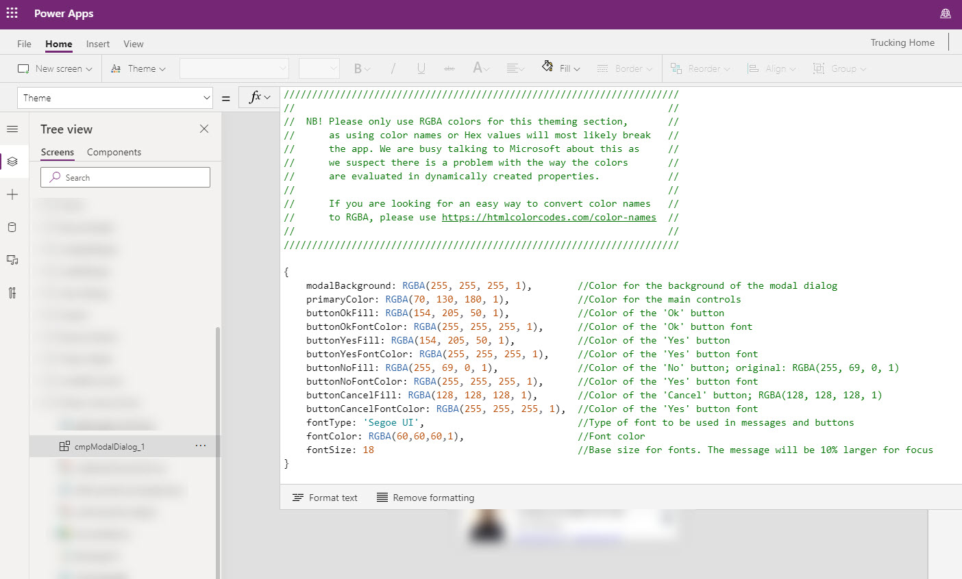
- The cmpModalDialog.Theme object contains certain color properties. These should always be kept as RGBA, as using color names or Hex values will most likely break the app. We are busy talking to Microsoft about this as we suspect there is a problem with the way the different color values are evaluated in dynamically created properties.
Popup Instructions:
The various buttons on the demo screen of the DEV-Canvas Power App Modal Dialog app can be used to check the various properties and combinations that can be used, but here is a full list. You can copy and paste the input configuration section that you require for your popup.
//////////////////////////////////////////////////////////////////////////////////////////////////////
// //
// The following object is 'sent' to the colDialogInstructions collection in order to invoke the //
// modal dialog. //
// //
// CODE START==> //
/* Collect(
colDialogInstructions,
{
// -- Generic Popup Info -- //
type: "Ok",
inputType: Blank(),
message: "Message to display to the user.",
source: "TheSourceButton",
iconType: Icon.Information,
iconColor: Color.OrangeRed,
// -- Input Type Configuration (REQUIRED if type = "input") -- //
// -- Link Information (OPTIONAL) -- //
// -- Response Section. (REQUIRED if you want to tglDialogResponseTrigger to perform
an action after the popup) -- //
responseAction: "ActionToPerform"
}
) <== CODE END //
*/ //
// See below descriptions of the properties in the popup instruction: //
// type: The type of popup that should be presented to the user. //
// This will cause the correct controls and buttons to become available //
// in the component: //
// "OK" //Simple information box with a message and an OK button //
// "YesNo" //Request confirmation from the user with the options to //
// click on Yes or No //
// //
// "YesNoCancel" //Request confirmation from the user with the options //
// to click on Yes, No, or Cancel. This might be used for a //
// prompt that might ask if the user would also like to publish //
// a document whilesaving it. Cancelling it would also result in //
// the save being cancelled //
// //
// "Input" //Allows input from the user to either either enter free text //
// or select a value from a drop down box //
// //
// inputType: //If the popup type is input, you can specify one of the //
// the following inputTypes: //
// "TextInput" //Free text input //
// //
// "TextArray" //Array of text values //
// that the user can select from //
// in drop down //
// //
// "Office365Users" //People picker using the Office365Users as //
// datasource //
// //
// "Rating" //Star rating selection of a value between two numbers //
// //
// "Slider" //Slider selection of a value between two numbers //
// //
// "PenInput" //Pen Input for signature and drawings //
// //
// message: //The message to be displayed to the user //
// //
// source: //The control or function that is calling the modal dialog //
// for logging or diagnostic purposes //
// //
// iconType: //Icon to display in the popup //
// //
// iconColor: //Icon color for the popup. Different colors can be //
// used to differentiate between information, warning or //
// error messages //
// //
// Config Section //The following config sections should be used to configure //
// the input controls for the required inputType. //
// These properties should be added to the --Input Type-- //
// Configuration section of the code. //
// //
// CODE START==>
/* configTextInput: {
default: "Test",
hintText: "Check this out",
tooltip: "Please supply name"
}, <== CODE END
*/
//
// CODE START==>
/* configTextArray: {
tooltip:"Please give us the name",
arrayList: ["Donald","Mickey"],
defaultValue: "Donald",
allowMultipleSelect: false
}, <== CODE END
*/
//
// CODE START==>
/* configOffice365Users: {
tooltip: "Please give us the name",
allowMultipleSelect: false
}, <== CODE END
*/
//
// CODE START==>
/* configRating: {
default:2,
tooltip:"Select a rating from one to 5",
max: 5,
showValue: true
}, <== CODE END
*/
//
// CODE START==>
/* configSlider: {
default:2,
tooltip:"Select a rating from 1 to 10",
min: 1,
max: 10,
showValue: true
}, <== CODE END
*/
//
// CODE START==>
/* configPenInput: {
tooltip:"Give us your million dollar signature",
size:1,
showControls: true
}, <== CODE END
*/ //
// Link Section //Links can be passed to the dialog for knowledge basis, wikis, //
// or help videos. The link object should be added to the //
// --Link Inforation--- section //
// //
// CODE START==>
/* link: {
label: "More Info",
url: "https://powerusers.microsoft.com",
toolip: "Check out more information about Power Apps"
}, <== CODE END
*/ //
// Response Section //REQUIRED if you want to tglDialogResponseTrigger to perform //
// an action after the popup. This is the property that will //
// be evaluated by the toggle to determine which action to //
// perform as part of the Switch function //
// //
// responseAction: "ResonseActionName"
// //
// //
//////////////////////////////////////////////////////////////////////////////////////////////////////
Popup Responses:
The glDialogResponseTrigger toggle control triggers on the colDialogResponses collection and is used to action responses from the model dialog. As part of the object that is 'sent' to the modal dialog, we include a responseAction property which identifies the action to take place if the user selects an option or selects an item from the drop down. This responseAction can then be tracked by this toggle to initiate certain code or functions. If the responseAction doesn't contain a value, then we don't have to do anything.
The tglDialogResponseTrigger on the demo screen of the DEV-Canvas Power App Modal Dialog app (or in the component) can be used to check the various properties that are returned from the popup, but here is a full list.
If(
    !IsBlank(varDialogResponse.responseAction),
    //The trigger will only action something if a responseAction value was sent to the dialog
    //The below examples are added to show the different ways that data is retrieved based on the type of       input that was specified in the popup instruction
    Switch(
        varDialogResponse.responseAction,
        "Get Text Value",
        Set(
            varText,
            varDialogResponse.responseData.textInput
        ),
        "Get Text Array Value(s)",
        Set(
            varTextArray,
            varDialogResponse.responseData.textArray
        ),
        "Get Office365Users Selected Value(s)",
        Set(
            varO365,
            varDialogResponse.responseData.office365Users
        ),
        "Get Rating Value",
        Set(
            varRating,
            varDialogResponse.responseData.rating
        ),
        "Get Slider Value",
        Set(
            varSlider,
            varDialogResponse.responseData.slider
        ),
        "Get Pen Input Value",
        Set(
            VarPenInput,
            varDialogResponse.responseData.penInput
        ),
        "Get Pen Input Value in Base64",
        Set(
            VarPenInputBase64,
            varDialogResponse.responseData.penInputBase64
        )
    )
);
- Mark as New
- Bookmark
- Subscribe
- Mute
- Subscribe to RSS Feed
- Permalink
- Report Inappropriate Content
Apologies - but how do I delete the component in an app I'm not wanting to use it in when it doesn't show up in the Components list? I have all these warnings but can't figure out how to delete it. The only way I can even view it is if I follow one of the warnings from the formula checker:

- Mark as New
- Bookmark
- Subscribe
- Mute
- Subscribe to RSS Feed
- Permalink
- Report Inappropriate Content
Thank you for sharing such awesome and much needed component. I started playing with it and noticed that it has the ability to include a link in the popup which is great but I was wondering how can that functionality be extended to work with Microsoft Teams Deep Links.
Currently, I have an app embedded in a Teams channel. if I place a link in the popup to a file in a channel in Teams, when clicked it opens the link in a browser window instead of within the Teams application.
I'm hoping there's a way and perhaps you can point me in the right direction on how to make use of deep links in the popup and/or it would be great to add this feature for the popup.
- Mark as New
- Bookmark
- Subscribe
- Mute
- Subscribe to RSS Feed
- Permalink
- Report Inappropriate Content
Fantastic component! I have it running in my first app, I do have a question...and this may be my newness to PA showing, but I need to use the Office365 dialog and need to patch(new) that to a sharepoint list. I need to pass the chosen O365 user and email to the list. Would I use the "responseAction" to do this? Any help would be greatly appreciated!
Thanks!
- Mark as New
- Bookmark
- Subscribe
- Mute
- Subscribe to RSS Feed
- Permalink
- Report Inappropriate Content
I have added to component library and it is working great. Thanks for making it available. However, I have tried to adjust the "fontSize" in the Theme custom property (in the app, not the component library) and it seems to take, but then reverts to the default fontSize (13) in the library. I can change the color of one of the buttons in the same way, and it works just fine. Any help on what I may be doing wrong would be appreciated. Thanks
- Mark as New
- Bookmark
- Subscribe
- Mute
- Subscribe to RSS Feed
- Permalink
- Report Inappropriate Content
Can you please share the source code ?
- Mark as New
- Bookmark
- Subscribe
- Mute
- Subscribe to RSS Feed
- Permalink
- Report Inappropriate Content
Excelent I am using it and works good.
So, I have an observation. When you say:
"Insert the component onto the required screen(s) into the main app by going to Insert=>Custom=>cmpModalDialog. If you would like to use the dialog on different screens, you have to add it to each of those screens."
It is important to make clear that is only the component, because the toggle just once. I try to copy both on three differents screens and the references of the OnCheck property on the toggle doesn't work.
Thanks for your great work, cheers!
- Mark as New
- Bookmark
- Subscribe
- Mute
- Subscribe to RSS Feed
- Permalink
- Report Inappropriate Content
Hey, excellent component and saves much time. Only have one issue with it. On iOS, the toggle OnCheck is not being triggered. Works fine in browser and in the studio, but on iOS within the PowerApps app, it's just not firing the OnCheck. The Toggle is located on a different screen than the components, and I am using multiple components in the app. Is there something else needed to get the toggle to fire? I saw a comment mentioning needing to reference the toggle's value from a dummy control, like a hidden label. Is that the recommended fix for this? Would be nice if that was noted as a known issue in the documentation.
- Mark as New
- Bookmark
- Subscribe
- Mute
- Subscribe to RSS Feed
- Permalink
- Report Inappropriate Content
Has anyone seen the issue where you have a YesNo type popup box and no matter the answer varDialogResponse.responseAction is empty. I have another modal popup on another screen and it works just fine, calls the right action. The troublesome one does not seem to be sending anything to toggle. I attached the code in the screen shots for both my button calling the popup and the toggle.
Button code:
Collect(
colDialogInstructions,
{
// -- Generic Popup Info -- //
type: "YesNo",
message: "Are You Sure You Want to Delete?",
source: "ThisButton",
iconType: Icon.Trash,
iconColor: Color.Coral,
// -- Input Type Configuration (REQUIRED if type = "input") -- //
// -- Link Information (OPTIONAL) -- //
// -- Response Section. (REQUIRED if you want to trigger an action) -- //
responseAction: "Delete Gen Exception",
originalFunctionRequestID: Blank()
}
);
Toggle on check code sample:
Switch(
varDialogResponse.responseAction,
"Delete Gen Exception",
If(
varDialogResponse.dialogButtonPressed = "Yes",
Remove(
'Monthly Compliance Step Approval Exceptions',
tblGeneralExceptions.Selected
);
Notify(
"Record Deleted",
NotificationType.Success,
3000
);
Navigate(
scnGeneralExceptions,
ScreenTransition.UnCoverRight
)
),
Appreciate the hard work guys
- Mark as New
- Bookmark
- Subscribe
- Mute
- Subscribe to RSS Feed
- Permalink
- Report Inappropriate Content
I've tried this instruction to add a responseAction but the action (navigate to screen) executes whether I click on Yes or No. How do I get it to do nothing if I click on No other than close the dialog?
- Mark as New
- Bookmark
- Subscribe
- Mute
- Subscribe to RSS Feed
- Permalink
- Report Inappropriate Content
Fantastic, and thanks, but this is page one stuff for applications with a UI - why is stuff like this not added as standard by Microsoft before things like Mixed Reality that nobody uses ?