- Power Apps Community
- Welcome to the Community!
- News & Announcements
- Get Help with Power Apps
- Building Power Apps
- Microsoft Dataverse
- AI Builder
- Power Apps Governance and Administering
- Power Apps Pro Dev & ISV
- Connector Development
- Power Query
- GCC, GCCH, DoD - Federal App Makers (FAM)
- Power Platform Integration - Better Together!
- Power Platform Integrations (Read Only)
- Power Platform and Dynamics 365 Integrations (Read Only)
- Community Blog
- Power Apps Community Blog
- Galleries
- Community Connections & How-To Videos
- Copilot Cookbook
- Community App Samples
- Webinars and Video Gallery
- Canvas Apps Components Samples
- Kid Zone
- Emergency Response Gallery
- Events
- 2021 MSBizAppsSummit Gallery
- 2020 MSBizAppsSummit Gallery
- 2019 MSBizAppsSummit Gallery
- Community Engagement
- Community Calls Conversations
- Hack Together: Power Platform AI Global Hack
- Experimental
- Error Handling
- Power Apps Experimental Features
- Community Support
- Community Accounts & Registration
- Using the Community
- Community Feedback
- Power Apps Community
- Galleries
- Canvas Apps Components Samples
- Re: Circle Progress Bar


- Mark as New
- Bookmark
- Subscribe
- Mute
- Subscribe to RSS Feed
- Permalink
- Report Inappropriate Content
Circle Progress Bar
03-may-2022 update: fixed division-by-zero error message showing up from time to times (thanks @cparedes for reporting this)
Hi all,
Based on @davidni's blog article (available here) I created a configurable Circular Progress Bar component.
Here is how it looks:

Parameters
Here are the properties you can set on the component:
INPUT
- Max (number) = maximum value (default is 100)
- Value (number) = actual progress value (default is 50)
- ShowLabel (boolean) = shows/hides the label in the center (default is True)
- LabelSize (number) = font size for the label in the center (default is 20)
- LabelColor (color) = color for the label in the center (default is Black)
- BarBgR, BarBgG, BarBgB (numbers) = red, green and blue components for the color of the background progress circle (default is the grey color on the capture above)
- BarR, BarG, BarB (numbers) = red, green and blue components for the color of the actual progress circle (default is the cyan color on the capture above)
- BarBgWidth (number) = width for the background progress circle
- BarWidth (number) = width for the actual progress circle
- LineCapRound (boolean) = if True draws the circle lines with a round line cap, otherwise line cap will be square (default is True)
- ValueMode (text) = how to display the value within the circle: X/Y or as a percentage value (use the ValueModeEnum output property as an enumeration to set the value)
- PercentageDecimals (number) = determines how many decimals are shown for the percentage value (only applicable if ValueMode is set to ValueModeEnum.Percentage)
OUTPUT
- ValueModeEnum (record) = use this enumeration to set the value of the ValueMode property (MaxValue shows the value as X/Y; Percentage shows the value as a percentage value, using the PercentageDecimals property to set how many decimals should be displayed)
Feel free to use it... If you have any comments or suggestions, please do not hesitate...
You will find the component right here:
https://github.com/e-gallis/PowerApps
Emmanuel
- Mark as New
- Bookmark
- Subscribe
- Mute
- Subscribe to RSS Feed
- Permalink
- Report Inappropriate Content
Hi all,
Just updated the component to allow two types of display for the value in the center:
- X/Y (as before)
- percentage value
So a new property called ValueMode will allow you to choose between those two modes. To set its value, use the enumeration property called ValueModeEnum like this:
ValueMode = MyCircleProgressBar.ValueModeEnum.Progress
-or-
ValueMode = MyCircleProgressBar.ValueModeEnum.MaxValue
If you choose the ValueModeEnum.Progress value for ValueMode, just know that the calculation of the current progress value will be automatic based on both the Max and the Value property values.
Also, using the PercentageDecimals property, you will be able to decide how many decimals should be displayed in case the value is shown as a percentage.
- Mark as New
- Bookmark
- Subscribe
- Mute
- Subscribe to RSS Feed
- Permalink
- Report Inappropriate Content
You Rock! Between this one and the fabric UI icons... Thank you!
Btw... any thoughts of changing your fabric UI component into a fluent UI component?
- Mark as New
- Bookmark
- Subscribe
- Mute
- Subscribe to RSS Feed
- Permalink
- Report Inappropriate Content
- Mark as New
- Bookmark
- Subscribe
- Mute
- Subscribe to RSS Feed
- Permalink
- Report Inappropriate Content
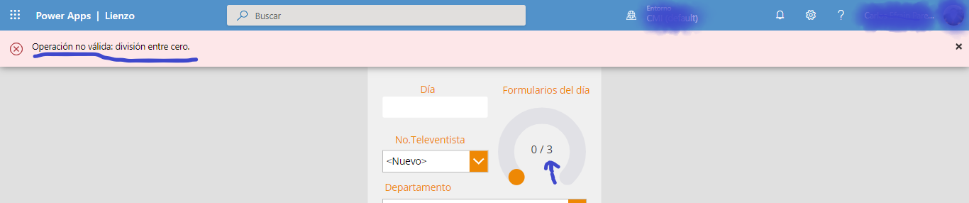
Hi @cparedes,
Mmmm... I have recently seen this error in other cases as well... It looks like some control property values are populated AFTER the execution of the formulas...
Since it's a bit hard to reproduce this error on my side, can you edit the component in your app and change these red portions of code:

to this:

And also change this:

to this:

If this fixes the issue I will update the component with the fix.
Waiting for your feedback...
- Mark as New
- Bookmark
- Subscribe
- Mute
- Subscribe to RSS Feed
- Permalink
- Report Inappropriate Content
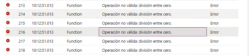
Hi @R3dKap
Thanks for your quickly response.
Your code Works perfectly!!!
I had already tried to add exactly that part of the code but I needed to validate "IsBlank" because it caused me the same error.
With the validation "IsBlank" the problem has been solved. Only additional I add in the "If" an "else" to set the value of my variable.
1)

2)


Thanks RedKap!!
- Mark as New
- Bookmark
- Subscribe
- Mute
- Subscribe to RSS Feed
- Permalink
- Report Inappropriate Content
Glad it works now... I'll update the component shortly... 😉