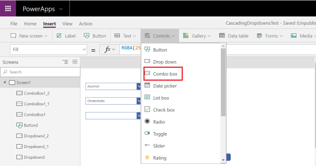
Cascading dropdowns are widely used user interface pattern.
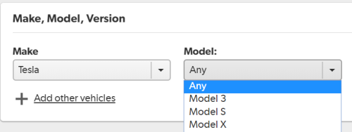
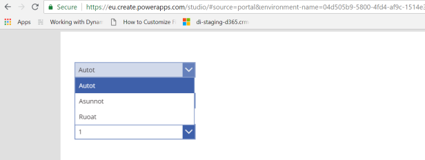
The screenshot above is from the mobile.de website. The user first selects the vehicle maker and after that, he is able to select the correct model.
How do we easily build this kind of hierarchical selections in PowerApps? Let's find out!
The contents of the hierarchy
Hierarchy of selections has to be stored somewhere. Each level of the hierarchy can have their own table. Alternatively, all levels can be stored on the single table. Like we do in this example. In practice, we use a single SharePoint list.
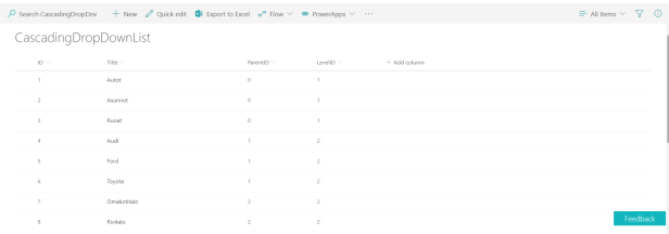
Used columns are
- ID - Choice id
- Title - The title of choice (shown to end-user)
- ParentId - Id for previous level choice this item belongs
Version 1 - Basic solution with drop down lists
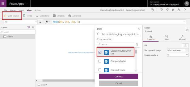
Let's start with empty PowerApps and add created SharePoint list as a data source.
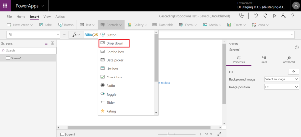
After that, we add three drop down lists.
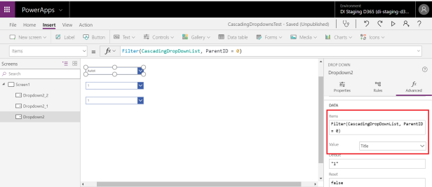
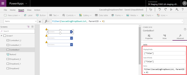
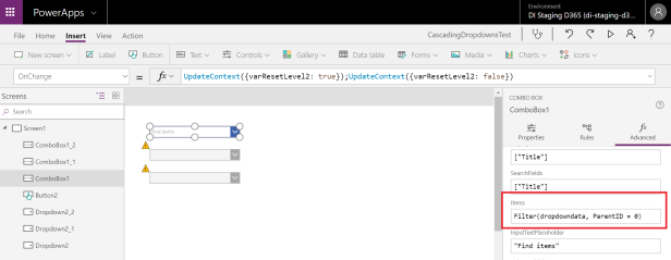
Pick the first drop down list and set it items to get values from the SharePoint list. Not all list items. Just items ParentId having value 0 (root level).
We want to show SharePoint list Title column value in our drop down list. So we pick Title into the drop down's Value property.
Time to test. Seems to be working!
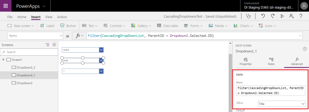
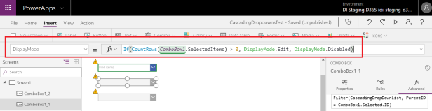
The second and third drop down list values are dependent on the preceding selections. This can be easily done by filtering Items. Item's parentId has to be same than previous selection's id.
Items = Filter(CascadingDropDownList, ParentId = ComboBox1.Selected.ID)
Don't forget to set Title as Value.
Let's do the same trick for the third drop down list and test how solution looks like.
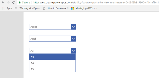
It works nicely!
However, this solution has two major flaws.
- In every list, the first item is selected by default
- The user can't search values from the list (important if there is plenty of items to select from)
The first one can be corrected by adding "Make selection" item as the first item in every category.
There has to be a more elegant way to do this.
Version 2 - Selection lists with search
Next, we replace all drop down controls with more versatile combo box controls.
Drop down and combo box control has identical items feature. We can use the exact same values in them than with drop down lists above. But for combo box, we can define separately
- Fields that are displayed in the list (Display Fields)
- Fields that are used as a search field when user filters value (Search Fields)
We use in both cases Title field and set the values as ["Title"].
And everything works just fine.
Version 3 - Disable / enable selections
By using combo box a user can search the desired value from the list. However, using combo boxes nicely in our solution needs a little bit of extra work.
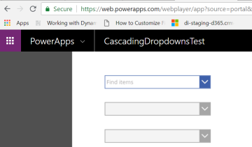
The initial situation looks cluttered. Is it self-explanatory that there will be items to choose in the second pulldown menu after you have selected values from the first one?
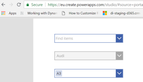
This is easy to fix. Just define second and third combo box display mode to disabled in the case when there is no item selected on combo box before that.
Now the options are active only after the user has selected values from the previous selection. Considerably better.
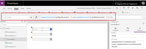
Version 4 - Cancel selections from lower levels when user cancels selection from upper level
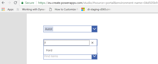
A user can remove the selection from combo box. In a hierarchical choice, this causes a problem. The figure below shows what happens when the user removes the first choice after making selections on every level.
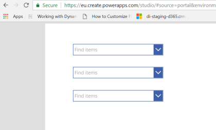
Lower choices should be removed also in case the user removes the upper choice.
For this, we need to create to variable: varResetLevel2 and varResetLevel3. Value of the variable is used in the drop down reset feature.
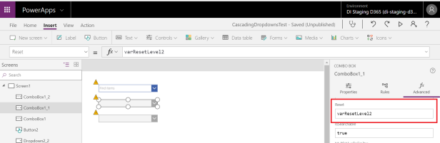
Whenever the value of the upper selection list is changed, we change (by using the variable) the reset value of the next combo box to true and immediately back to false. This removes selected item from drop down control.
Version 5 - Optimizing performance by using the collection
All three combo boxes use the same SharePoint list as a data source.
Our PowerApps will be clearly smoother if we load on the application startup (OnStart) the content of SharePoint list into the collection. This is done by ClearCollect command.
ClearCollect(dropdowndata, CascadingDropDownList)
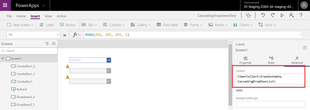
Now, the content of the selection lists can be constructed by using a collection that is already in memory. Let's change each selection list to use that collection as a data source instead of the SharePoint list.
Now SharePoint list values are retrieved only once. A user can select and unselect values as much as she/she likes and our PowerApps runs smoothly without connecting SharePoint.
 ManishM
on:
How do you bulk download attachment files from a D...
ManishM
on:
How do you bulk download attachment files from a D...
 on:
What you should know when recruiting for a Power P...
on:
What you should know when recruiting for a Power P...
 on:
Introduction of AI Builder in Power Automate: How ...
on:
Introduction of AI Builder in Power Automate: How ...
 on:
Top-down 2D game engine proof of concept
on:
Top-down 2D game engine proof of concept