- Power Apps Community
- Welcome to the Community!
- News & Announcements
- Get Help with Power Apps
- Building Power Apps
- Microsoft Dataverse
- AI Builder
- Power Apps Governance and Administering
- Power Apps Pro Dev & ISV
- Connector Development
- Power Query
- GCC, GCCH, DoD - Federal App Makers (FAM)
- Power Platform Integration - Better Together!
- Power Platform Integrations (Read Only)
- Power Platform and Dynamics 365 Integrations (Read Only)
- Community Blog
- Power Apps Community Blog
- Galleries
- Community Connections & How-To Videos
- Copilot Cookbook
- Community App Samples
- Webinars and Video Gallery
- Canvas Apps Components Samples
- Kid Zone
- Emergency Response Gallery
- Events
- 2021 MSBizAppsSummit Gallery
- 2020 MSBizAppsSummit Gallery
- 2019 MSBizAppsSummit Gallery
- Community Engagement
- Community Calls Conversations
- Hack Together: Power Platform AI Global Hack
- Experimental
- Error Handling
- Power Apps Experimental Features
- Community Support
- Community Accounts & Registration
- Using the Community
- Community Feedback
- Power Apps Community
- Galleries
- Webinars and Video Gallery
- Friday Functions Series | Punch List with Mini Per...
Friday Functions Series | Punch List with Mini Percent Complete Chart
05-31-2018 19:52 PM - last edited 10-22-2018 08:57 AM


- Mark as New
- Bookmark
- Subscribe
- Mute
- Subscribe to RSS Feed
- Permalink
- Report Inappropriate Content
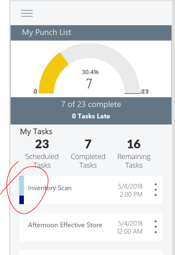
Friday Functions Series | Punch List with Mini Percent Complete Chart
Audrie Gordon from the PowerApps team shows how to take two rectangles and make your own mini percent complete bar chart. This could be modified to be a fun Gantt Chart too! Please share if you have you own ideas on how to achieve this idea - in your own creative ways!
Enjoy your weekend!
Audrie

watch?v=5qfGxYrmSpM
- Mark as New
- Bookmark
- Subscribe
- Mute
- Subscribe to RSS Feed
- Permalink
- Report Inappropriate Content
Thanks Audrie,
I really like the templatepadding and the thisitem.isselected property - very handy!
- Mark as New
- Bookmark
- Subscribe
- Mute
- Subscribe to RSS Feed
- Permalink
- Report Inappropriate Content
I like how you made the vertical ellipsis--I do not like importing an image if it can be done in PA 🙂
@8bitclassroom