- Power Apps Community
- Welcome to the Community!
- News & Announcements
- Get Help with Power Apps
- Building Power Apps
- Microsoft Dataverse
- AI Builder
- Power Apps Governance and Administering
- Power Apps Pro Dev & ISV
- Connector Development
- Power Query
- GCC, GCCH, DoD - Federal App Makers (FAM)
- Power Platform Integration - Better Together!
- Power Platform Integrations (Read Only)
- Power Platform and Dynamics 365 Integrations (Read Only)
- Community Blog
- Power Apps Community Blog
- Galleries
- Community Connections & How-To Videos
- Copilot Cookbook
- Community App Samples
- Webinars and Video Gallery
- Canvas Apps Components Samples
- Kid Zone
- Emergency Response Gallery
- Events
- 2021 MSBizAppsSummit Gallery
- 2020 MSBizAppsSummit Gallery
- 2019 MSBizAppsSummit Gallery
- Community Engagement
- Community Calls Conversations
- Hack Together: Power Platform AI Global Hack
- Experimental
- Error Handling
- Power Apps Experimental Features
- Community Support
- Community Accounts & Registration
- Using the Community
- Community Feedback
- Power Apps Community
- Galleries
- Webinars and Video Gallery
- Re: PowerApps Tutorial - Responsive Designs | Part...
Re: PowerApps Tutorial - Responsive Designs | Part 2. X and Y Coordinates
11-22-2019 06:00 AM


- Mark as New
- Bookmark
- Subscribe
- Mute
- Subscribe to RSS Feed
- Permalink
- Report Inappropriate Content
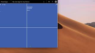
PowerApps Tutorial - Responsive Designs | Part 2. X and Y Coordinates
In this video, we continue with the tutorial on the new responsive functionality in PowerApps but this time we will look in more detail at the X and Y coordinates and how to use them on a responsive application. And yes, we will test the app on a phone again 😉
We also say good bye to dragging and dropping in PowerApps for now, as this will break any special XY coordinates that you require for responsive designs.
Here is the fabulous blog from the friendly people at Microsoft that discusses this topic in great detail:
https://docs.microsoft.com/en-us/powerapps/maker/canvas-apps/create-responsive-layout
Please remember to subscribe and hit the bell to be notified of new videos
https://www.youtube.com/davestechtips?sub_confirmation=1
watch?v=XLErplsjjG0
- Mark as New
- Bookmark
- Subscribe
- Mute
- Subscribe to RSS Feed
- Permalink
- Report Inappropriate Content
@DavesTechTips Thanks a lot for the 2 videos. I used them as a starting point for making responsive multi column forms. If you have a moment I'd like to share a file with you. I've done something that works as I intended. But I'm not sure why it works. It would be great if you could take a look at it for me. Do you mind?
While trying to figure out why it works one of my coworkers reminded me of the "Bumblebee Principle". LOL
Have a great day!
- Mark as New
- Bookmark
- Subscribe
- Mute
- Subscribe to RSS Feed
- Permalink
- Report Inappropriate Content
Hi @Anonymous ,
Great to hear, sounds you are busy with some great work, can't wait to see it. Please pop me a mail on dawid.vanheerden@ukuvuma.co.za with 3 times that would suit you for a conference call in the next two weeks.
I hope you have a wonderful day!
- Mark as New
- Bookmark
- Subscribe
- Mute
- Subscribe to RSS Feed
- Permalink
- Report Inappropriate Content
I will contact you regarding this. It's been a very busy week here. Thanks for your contribution.