- Power Apps Community
- Welcome to the Community!
- News & Announcements
- Get Help with Power Apps
- Building Power Apps
- Microsoft Dataverse
- AI Builder
- Power Apps Governance and Administering
- Power Apps Pro Dev & ISV
- Connector Development
- Power Query
- GCC, GCCH, DoD - Federal App Makers (FAM)
- Power Platform Integration - Better Together!
- Power Platform Integrations (Read Only)
- Power Platform and Dynamics 365 Integrations (Read Only)
- Community Blog
- Power Apps Community Blog
- Galleries
- Community Connections & How-To Videos
- Copilot Cookbook
- Community App Samples
- Webinars and Video Gallery
- Canvas Apps Components Samples
- Kid Zone
- Emergency Response Gallery
- Events
- 2021 MSBizAppsSummit Gallery
- 2020 MSBizAppsSummit Gallery
- 2019 MSBizAppsSummit Gallery
- Community Engagement
- Community Calls Conversations
- Hack Together: Power Platform AI Global Hack
- Experimental
- Error Handling
- Power Apps Experimental Features
- Community Support
- Community Accounts & Registration
- Using the Community
- Community Feedback
- Power Apps Community
- Community Blog
- Power Apps Community Blog
- Quick & Easy Barcode-QR Code Generator
- Subscribe to RSS Feed
- Mark as New
- Mark as Read
- Bookmark
- Subscribe
- Printer Friendly Page
- Report Inappropriate Content
- Subscribe to RSS Feed
- Mark as New
- Mark as Read
- Bookmark
- Subscribe
- Printer Friendly Page
- Report Inappropriate Content
This is a self-contained app that incorporates the ability to generate one or more Barcodes/QR Codes and directly to local storage (a local drive, Mobile Device storage), OneDrive or email them as attachments to a selected email address in a single easy to use interface.
For this app you will need to link to an Api that will generate the code for you. I am using the bwip-js online API found here: Online Barcode API. All the documentation for formatting the request as well as a listing of all the different barcode & QR code types are accessible from this link.
What you will need:
- The Office365Outlook connector
- A dropdown, radio control or icons for the user to select either barcode or QR code.
- Optional: A dropdown to select a barcode type if you will be generating different barcode types
- A text input for the barcode text or QR Code link.
- A reset icon for the text input
- A button or icon to encode the QR code link
- A set of controls to select background and foreground colors (Optional)
- A gallery to select a color (Optional)
- A gallery with image and title to store images that are to be sent to an email address. Subtitle is not needed.
- A text input for the Barcode/QR code file name
- A button or icon to save the image to the gallery
- A text input for the email address
- A button and/or icon to send the gallery images to a specified email address
- A button and/or icon to Upload the images to OneDrive
- Optional: Upload sample images to be used in the image control
Step 1: Setup your image type selector. If you are using icons, you will need to set a variable on select to “Barcode” or “QR Code” to match the selection.
Dropdown or Radio controls Items Property: [“Barcode”, “QR Code”]
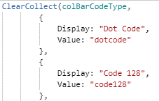
Step 2 (Optional): Setup the barcode type dropdown. This is best as a collection and looks like this (you will need the information from the above link to get the values for each barcode type)
Step 3: Setup the image control
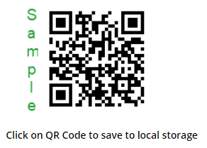
I have a sample image for both QR Code and for Barcode that I am using. You will structure your Switch statement accordingly.
Switch(
   cvCode,

"Barcode", If(!IsBlank(tiBarcodeText), $"https://bwipjs-api.metafloor.com/?bcid={cvBCType}&includetext&text={cvBCText}", Barcode),
"QR Code", If(!IsBlank(rteQRText), $"https://bwipjs-api.metafloor.com/?bcid=qrcode&barcolor=000000&text={cvHTMLText}", SampleQRCode)
)
In the Barcode Api link, ‘bcid’ is the type of barcode. This can be hardcoded if you are only working with a single barcode type, e.g. Ean-14, GS-128 etc. ‘includetext’ displays the text string underneath the barcode itself. It does not have to be included.
For the QR code, the bcid is hard-coded and the color is set to black. Note: you can set the color to any 6 character hex value (minus the # symbol) you wish to use. The text for the QR code is the Rich Text Editor text.
In the example above the string is created using the ‘$-Strings’ syntax rather than the normal concatenate syntax. The ‘&’ characters are a required part of the string. If you are not familiar with the $-Strings syntax, this article by Matthew Devaney is an excellent write-up about it and how to use it. $-Strings: A Better Way To Concatenate Text Strings in Power Apps .
IMPORTANT NOTE: You must encode your QR Code URL when using the bwjp-js api so it will properly render spaces in the URL for SharePoint and similar links.
Step 4: In the icon OnSelect set your encoding for the QR code link. You can set the filename and email address text inputs to disabled using the DisplayMode property:
If( cvCode = "QR Code" && IsBlank(varHTMLText), DisplayMode.Disabled, DisplayMode.Edit)
Set(varHTMLText, Substitute(
    EncodeUrl(
        Substitute(
            Substitute(tiBarcodeText.Text, "a href", "ahref"), " ", "%20")
                ), "ahref", "a%20href"
        )
)
Step 5: Create your gallery collection either in app OnStart or OnVisible of the screen. You can name the collection whatever you wish but it is critical that you keep the column names exactly as you see here. If you change the column names the images will not send correctly (you can see the explanation for this here. Power Apps Email Attachments :
Collect(colImages,
        {
            ContentBytes:"",
            Name:"",
            '@odata.type': "",
            Image: ""
        }
    );
Clear(colImages)
Set the gallery Image to ThisItem.ContentBytes and the Title to ThisItem.Name
Step 6: Setup the save button/icon. Reset the controls.
Collect(colImages,
        {
            ContentBytes:imgSelectedCode.Image,
            Name: $"{tiCodeFilename.Text}.png",
            '@odata.type': "",
            Image: imgSelectedCode.Image
        }
    );

Reset(tiCodeFilename); Reset(tiBarcodeText)
Step 7: Set the button/icon for sending email. Attachments is expecting a record so it must be formatted as in the image. Clear the collection and reset controls.
Office365Outlook.SendEmailV2(tiSendToEmail.Text, $"Generated {cvCode}s", "See Attached", {Attachments: GalleryCodes.AllItems});
Clear(colImages);
UpdateContext({ cvReset: true });
UpdateContext({ cvReset: false, cvBCType: Blank(), cvBCText: Blank() })
Step 8: Set the button/icon for uploading the code(s) to OneDrive.
ClearCollect(colFiles, ShowColumns(GalleryCodes.AllItems, "Image", "Name"));

QRCodetoOneDrive.Run(JSON(colFiles, JSONFormat.IncludeBinaryData));
Clear(colImages)
Step 9 (Optional): Give users of the app the ability to set the color for the barcode/QR Code. Using 2 check boxes, a text input and 2 icons, users can use to set the 6 digit hex code for the background and/or foreground color they want. A gallery of color selections can also be provided so they can choose a color they would like. See the attached text file for the Gallery color collection.
To create the color selection part, I used a standard container with a fill color and added the check boxes, the text input control and the 2 icons. In the OnSelect property of the check icon
If(
    chkboxForegroundSelect.Value && !IsBlank(tiNewColor), UpdateContext({ cvForegroundHexColor: tiNewColor.Text }),
    chkboxBackgroundSelect.Value && !IsBlank(tiNewColor), UpdateContext({ cvBackgroundHexColor: tiNewColor.Text })
);

Set(varReset, true); Set(varReset, false)
The reset icon resets the checkboxes and the text input.
If you want to include a gallery of colors to select from (see attached CSSColorSelection.zip), the gallery will need:
- An icon to display the color (Fill is set to ThisItem.RGB)
- A label to show the color name (ThisItem.Name)
- A checkbox for background
- A checkbox for Foreground.
I have mine in a container. The container is not visible until the 'Select a color from the gallery' button is clicked (sets cvShowGallery to true). I have added a fill color to the container.
The default property for the background and foreground check boxes is set to ThisItem.IsSelectedForeground or ThisItem.IsSelectedBackground respectively.
In the OnCheck property of the Foreground checkbox
Switch(IsBlank(cvForegroundHexColor),
    true, Patch(colColors, ThisItem, {IsSelectedForeground: true}); UpdateIf(colColors, ThisItem.IsSelectedBackground = true, {IsSelectedBackground: false}); UpdateContext({ cvForegroundHexColor: ThisItem.Hex}),
    false, Patch(colColors, ThisItem, {IsSelectedForeground: true}); UpdateIf(colColors, ThisItem.IsSelectedBackground = true, {IsSelectedBackground: false});UpdateIf(colColors, Hex = cvForegroundHexColor, {IsSelectedForeground: false}); UpdateContext({ cvForegroundHexColor: ThisItem.Hex })
)
In the OnUncheck property
UpdateContext({ cvForegroundHexColor: "" }); Patch(colColors, ThisItem, {IsSelectedForeground: false})
In the OnCheck property of the Background checkbox
Switch(IsBlank(cvBackgroundHexColor),
    true, Patch(colColors, ThisItem, {IsSelectedBackground: true}); UpdateIf(colColors, ThisItem.IsSelectedForeground = true, {IsSelectedForeground: false}); UpdateContext({ cvBackgroundHexColor: ThisItem.Hex}),
    false, Patch(colColors, ThisItem, {IsSelectedBackground: true}); UpdateIf(colColors, ThisItem.IsSelectedForeground = true, {IsSelectedForeground: false});UpdateIf(colColors, Hex = cvBackgroundHexColor, {IsSelectedBackground: false}); UpdateContext({ cvBackgroundHexColor: ThisItem.Hex })
)
In the OnUncheck property for the Background checkbox
UpdateContext({ cvBackgroundHexColor: "" }); Patch(colColors, ThisItem, {IsSelectedBackground: false})
The check icon makes the gallery visible/not visible. The cancel icon sets the variables blank, makes the containers not visible and resets the color collection so background and foreground are not checked.
UpdateContext({ cvBackgroundHexColor: Blank(), cvForegroundHexColor: Blank(), cvShowGallery: !cvShowGallery}); UpdateIf(colColors, IsSelectedBackground = true, {IsSelectedBackground: false}); UpdateIf(colColors, IsSelectedForeground = true, {IsSelectedForeground: false})
Get the sample app HERE!
Shout out to Shane Young @Shanescows and Matthew Devaney @mattbdevaney. Their content was invaluable in the making of this app.
You must be a registered user to add a comment. If you've already registered, sign in. Otherwise, register and sign in.
- babloosingh5556 on: Multilingual support in Canvas Apps Using Microsof...
-
 Amik
on:
Dynamically translate dropdown options based on a ...
- DEEPANRAJ2 on: Empower Your Portal with Dynamic Calendar Views: A...
- Covenant_Bolaji on: Strategizing Automation: Identifying the Right Tas...
- josh_1999 on: How to Create Login page in PowerApps using ShareP...
-
 ManishM
on:
How do you bulk download attachment files from a D...
-
dhock
 on:
What you should know when recruiting for a Power P...
- CarlosHernandez on: How to increase Do Until Loop in Microsoft Flow?
-
sonuomroutlook
 on:
Introduction of AI Builder in Power Automate: How ...
- arggghhhhh on: Generate Customer Voice Survey Invitations using C...
- 04-28-2024 - 04-29-2024
- 04-21-2024 - 04-27-2024
- 04-14-2024 - 04-20-2024
- 04-07-2024 - 04-13-2024
- 03-31-2024 - 04-06-2024
- 03-24-2024 - 03-30-2024
- 03-17-2024 - 03-23-2024
- 03-10-2024 - 03-16-2024
- 03-03-2024 - 03-09-2024
- 02-25-2024 - 03-02-2024
- 02-18-2024 - 02-24-2024
- 02-11-2024 - 02-17-2024
- 02-04-2024 - 02-10-2024
- 01-28-2024 - 02-03-2024
- View Complete Archives


